
Pink is no longer relegated to nurseries or bubblegum-themed playrooms. In the world of modern interior design, pink has undergone a massive sophisticated glow-up. From the earthiness of terracotta-pinks to the moody elegance of mauve and the high-energy punch of fuchsia, this color family offers a versatility that few other hues can match. Whether you are looking to create a serene sanctuary or a bold statement piece, there is a shade of pink that fits your aesthetic.
In this guide, we explore ten breathtaking pink room ideas that prove this color is a timeless powerhouse. These designs balance warmth, style, and personality, offering plenty of inspiration for your next home makeover.
1. Blush Minimalism
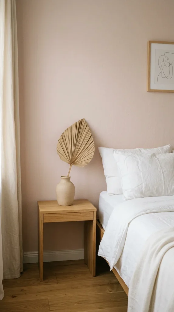
Blush pink is the ultimate “new neutral.” It provides enough color to feel warm and intentional without overwhelming the senses. In a minimalist setting, blush works beautifully alongside crisp whites and light wood tones like ash or oak. The key to mastering this look is simplicity. Instead of cluttering the space, let the soft wall color act as a backdrop for architectural lines and high-quality textiles. This approach creates a “cloud-like” atmosphere that is perfect for bedrooms or reading nooks where relaxation is the priority.
2. Dusty Rose Boho
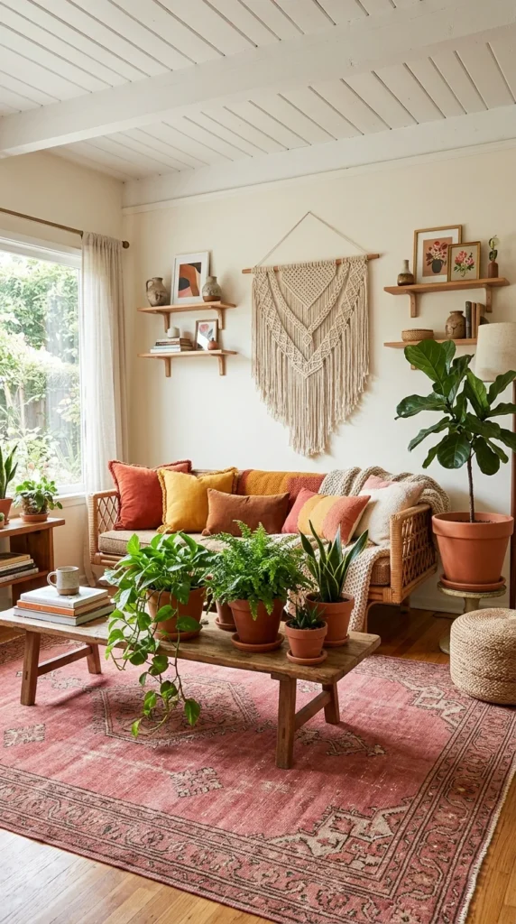
If you love a space that feels lived-in and organic, dusty rose is your best friend. This muted, earthy version of pink pairs perfectly with bohemian elements like rattan furniture, jute rugs, and an abundance of indoor greenery. Unlike brighter pinks, dusty rose has a desaturated quality that allows it to blend seamlessly with natural materials. Consider layering different textures—think a chunky knit pink throw over a tan leather sofa—to create a cozy, multi-dimensional environment that feels both grounded and whimsical.
3. Hot Pink Accents
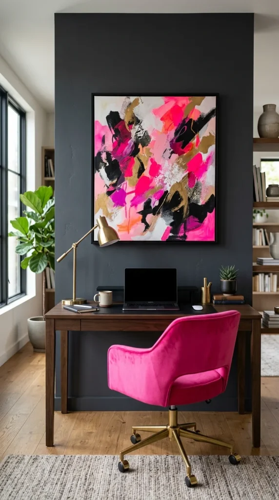
You don’t need to paint all four walls to make a statement. Hot pink and fuchsia are high-energy colors that work best as exclamation points within a room. In a neutral or dark-toned space, a single piece of furniture or a bold piece of art in a “Barbiecore” pink can instantly energize the atmosphere. This look is particularly effective in home offices or creative studios where a pop of color can stimulate focus and creativity. To keep it sophisticated, pair these loud pinks with “grounding” colors like navy blue, forest green, or charcoal gray.
4. Gilded Luxury
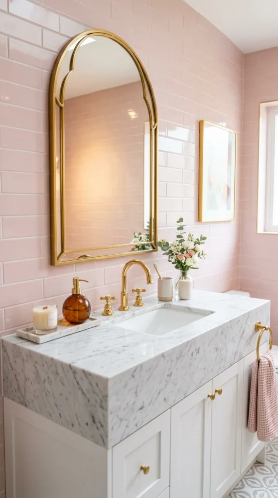
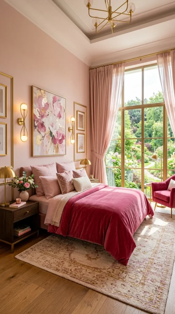
Pink and gold are a match made in design heaven. When you pair a soft pink palette with metallic accents—specifically gold, brass, or copper—the result is an instant infusion of glamour. This combination works exceptionally well in bathrooms and kitchens. Imagine soft pink cabinetry accented with brushed gold hardware, or a pink powder room with an ornate gold-framed mirror. The warmth of the metal complements the undertones of the pink, creating a space that feels expensive, curated, and undeniably chic.
5. Velvet Textures
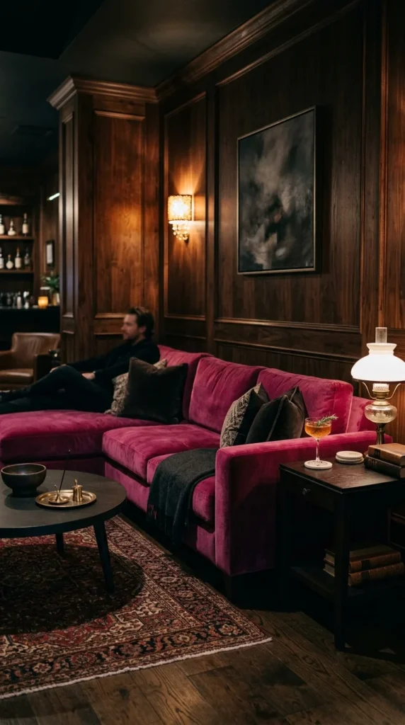
Texture changes everything. A pink wall might look one way, but a pink velvet sofa looks entirely another. Velvet absorbs and reflects light in a way that gives pink incredible depth and richness. For a sophisticated “adult” take on the pink room, opt for jewel-toned pinks like magenta, plum-pink, or raspberry in heavy fabrics. These materials add a sense of weight and luxury to a room, making it feel cozy during the winter and opulent year-round. Pair velvet seating with dark wooden floors or metallic side tables to complete the look.
6. Geometric Patterns
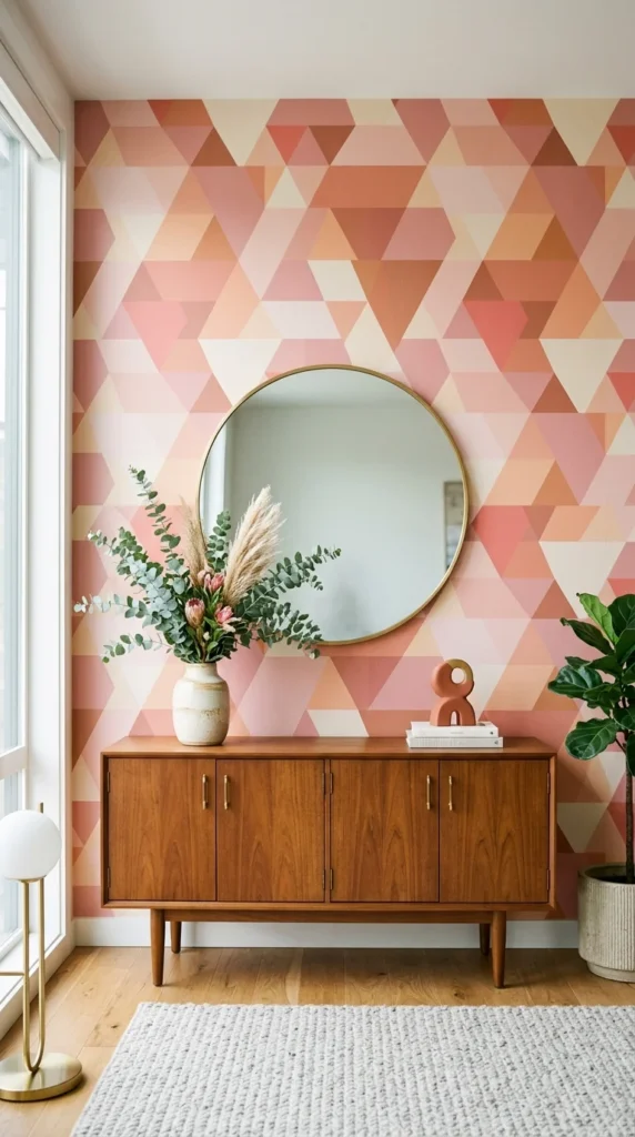
For those who find solid colors a bit too stagnant, geometric patterns offer a way to introduce pink with a modern, playful edge. Whether it’s through wallpaper, a tiled backsplash, or a patterned rug, geometric shapes break up the color and add visual interest. You can go for a retro 1970s vibe with curved shapes and shades of coral, or a sharp, contemporary look with crisp triangles in blush and gray. This is an excellent way to define a specific zone in an open-concept home, such as a dining area or an entryway.
7. Monochromatic Layers
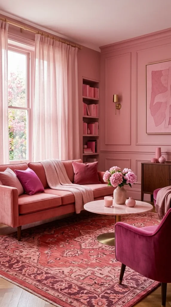
The monochromatic trend is all about “tonal layering.” Instead of trying to find one perfect pink, you use five or six different shades throughout the room. The secret to making this work without it looking like a candy shop is to vary the saturation and the texture. Put a pale pink matte wall behind a medium-pink satin curtain, and place a dark pink wool rug on the floor. This creates a “wrapper” effect that feels incredibly cohesive and designer-led. It’s a bold move, but when executed with different shades, it’s one of the most calming design choices you can make.
8. Floral Romantics
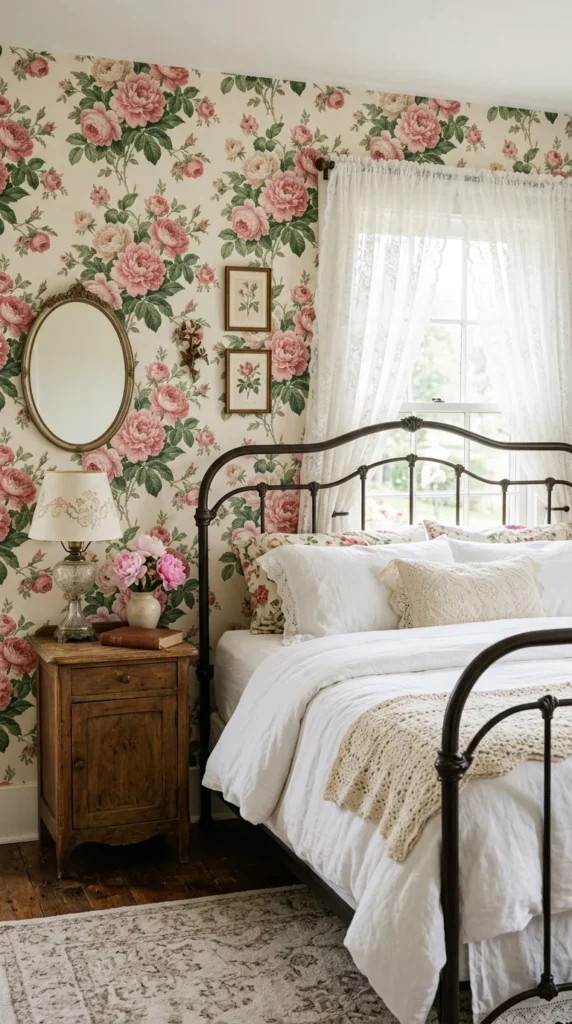
Pink and florals are a classic combination, but the modern version leans toward “Cottagecore” or vintage maximalism. Instead of tiny, dated prints, look for large-scale botanical wallpapers or hand-painted floral murals. This adds a sense of romance and nostalgia to a room. To keep the look from feeling too “shabby chic,” balance the floral pinks with modern elements, like a sleek lamp or a contemporary rug. This style is perfect for guest rooms or master suites where you want to evoke a sense of timeless charm and comfort.
9. Moody Mauve
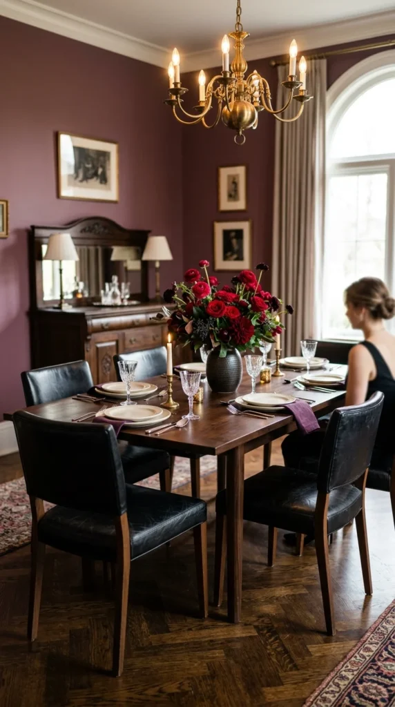
Mauve is the sophisticated older sister of pink. It contains hints of purple and gray, making it a “moody” alternative that feels very grown-up. Mauve works beautifully in formal spaces like dining rooms or libraries. It has a unique ability to change character depending on the light; in the morning, it looks fresh and airy, while at night under warm lamplight, it becomes dark and intimate. Pairing mauve with dark woods, black accents, and leather textures creates a masculine-meets-feminine balance that is incredibly alluring.
10. Scandinavian Pastel
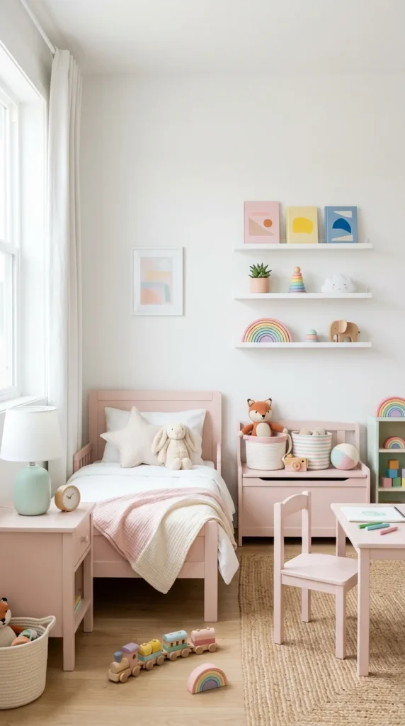
The Scandinavian design philosophy—Scandi—is all about light, functionality, and a connection to nature. When you bring pink into this aesthetic, it’s usually in the form of very light, “icy” pastels. Use pink as a functional color—perhaps a pink painted wooden chair or a pink storage unit—against a backdrop of white walls and light-colored floors. This look is clean, bright, and avoids the “clutter” often associated with colorful rooms. It’s an ideal choice for nurseries, playrooms, or even a modern kitchen where you want a hint of sweetness without sacrificing the “clean” look.